

WARPLINE
Inspired by my fascination with space, this conceptual branding project explores the intersection of futuristic innovation and luxury travel. I challenged myself to develop a brand identity for an interstellar flight company that feels cutting-edge while maintaining the sophistication of a premium service.
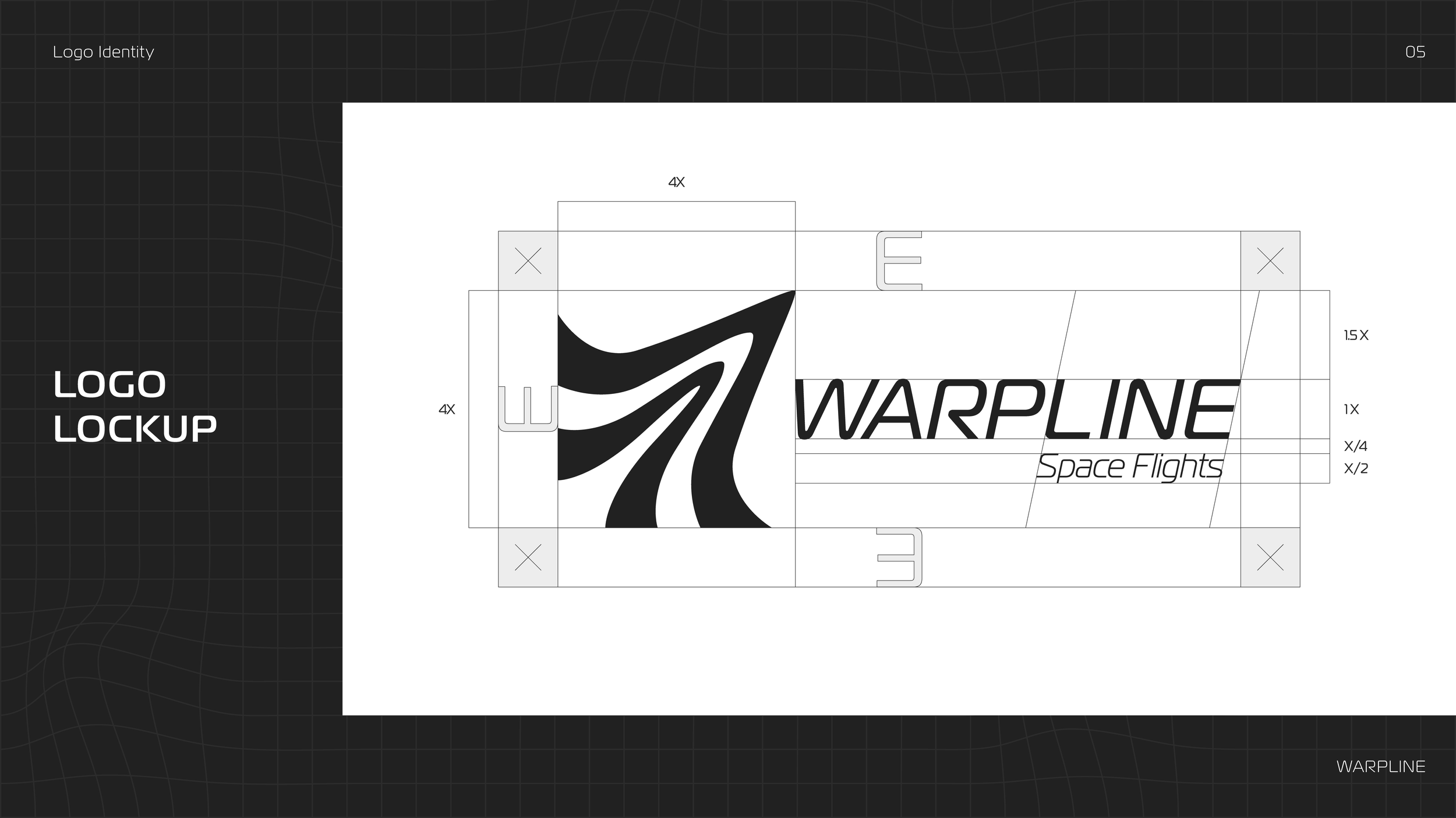
I started by coming up with a name, settling on "Warpline" based on a combination of the words "warp" and "airline", imagining that this company would essentially operate like an air travel service in space.
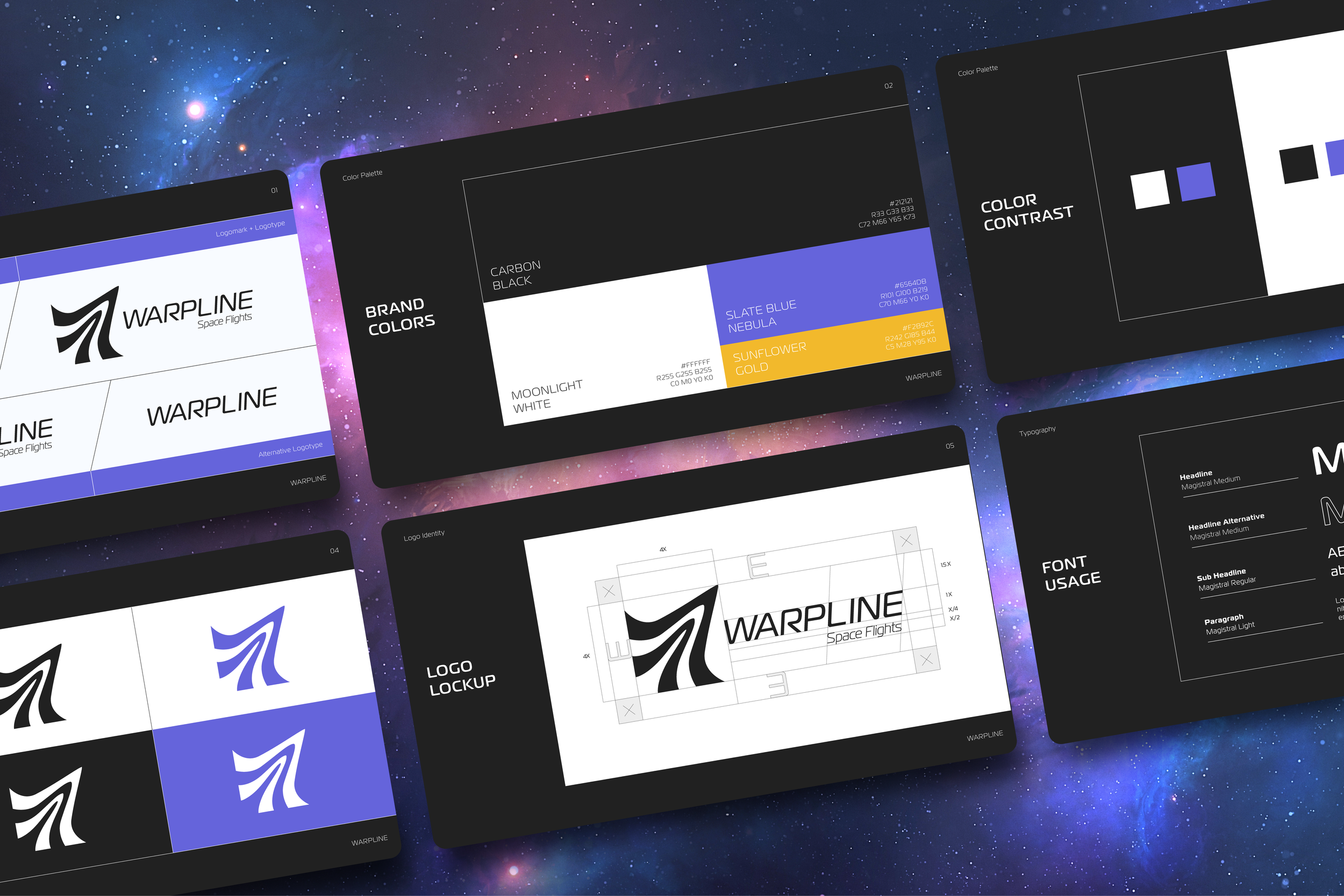
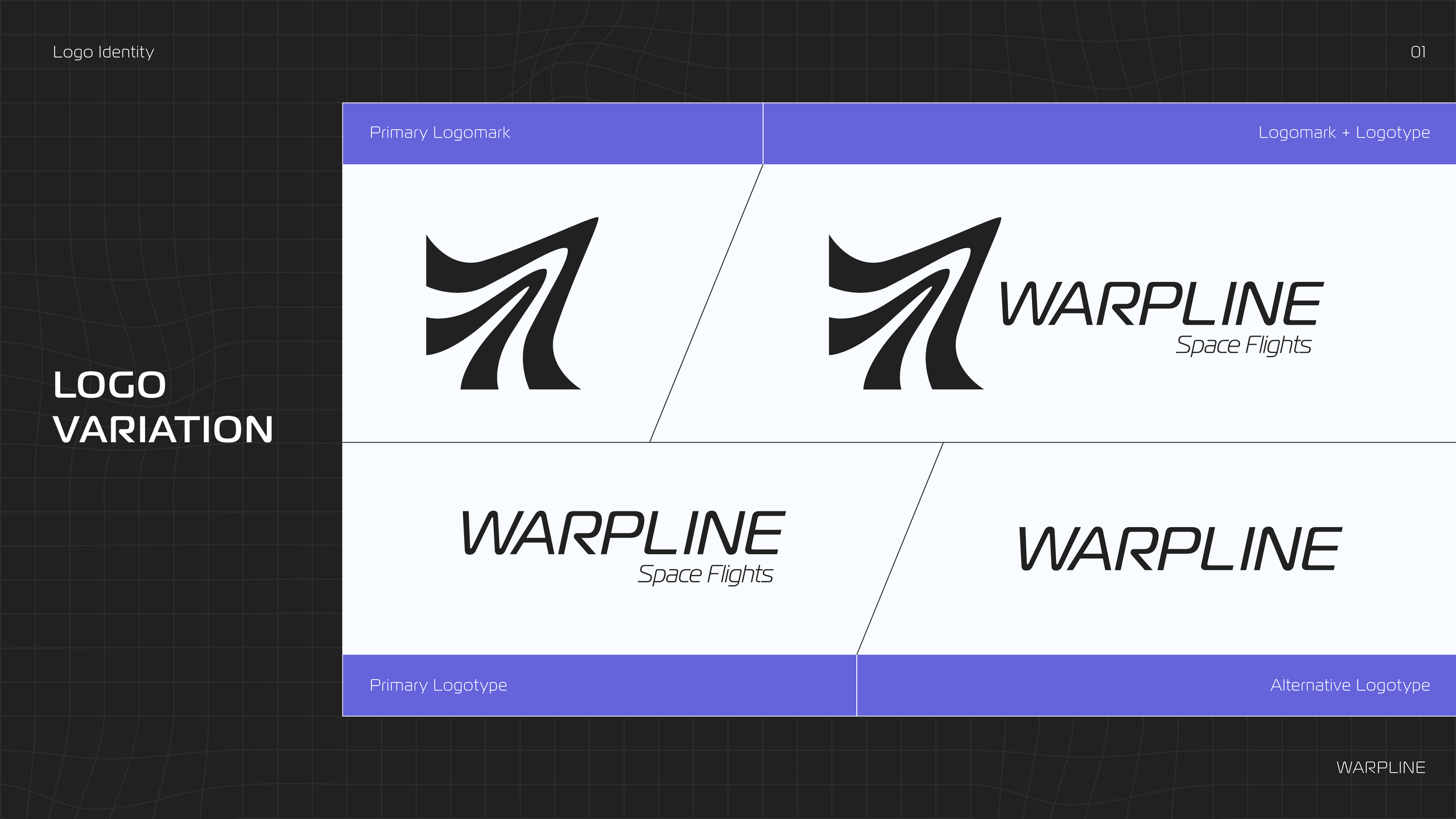
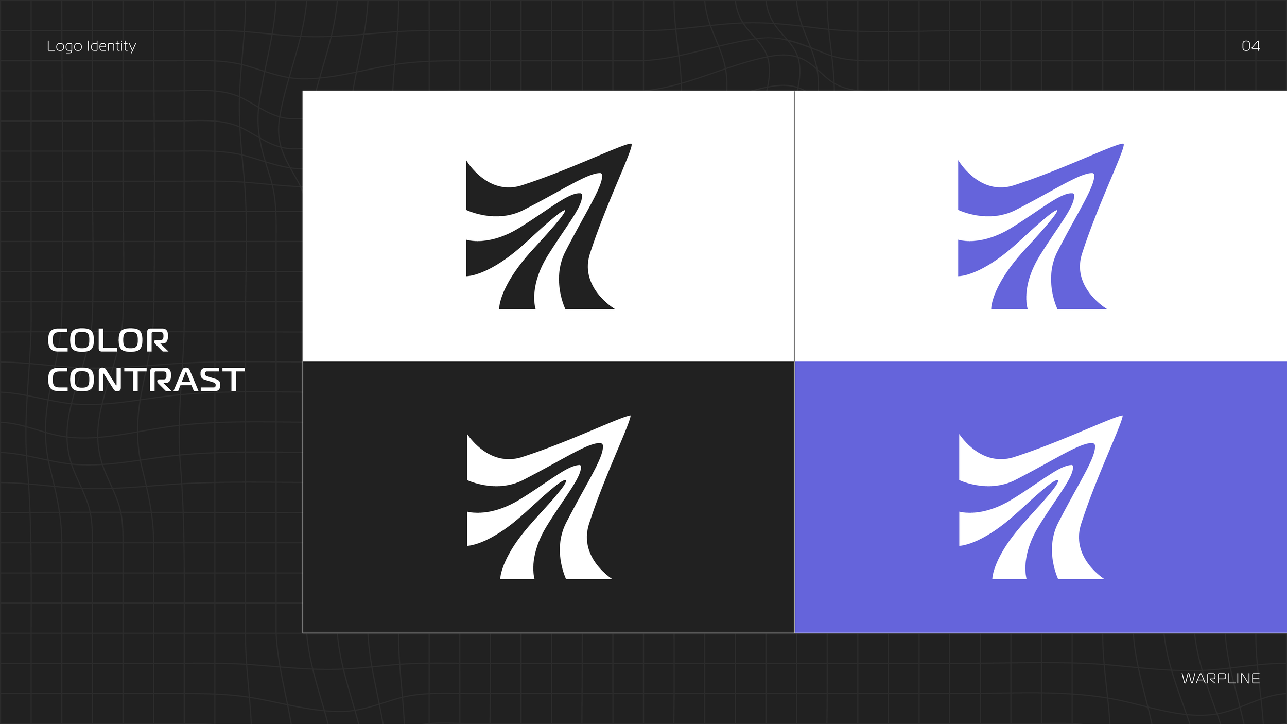
From there I aimed to create a logo that tied into the brand name. I wanted it to be bold and dynamic, evoking a feeling of strength and speed. I came up with the idea of two lines that had been warped and stretched by the velocity of a high-speed object. The mark combines smooth curves with hard edges, reflecting the brand’s balance between the exhilarating speed of space travel and the stability expected from a trusted brand.
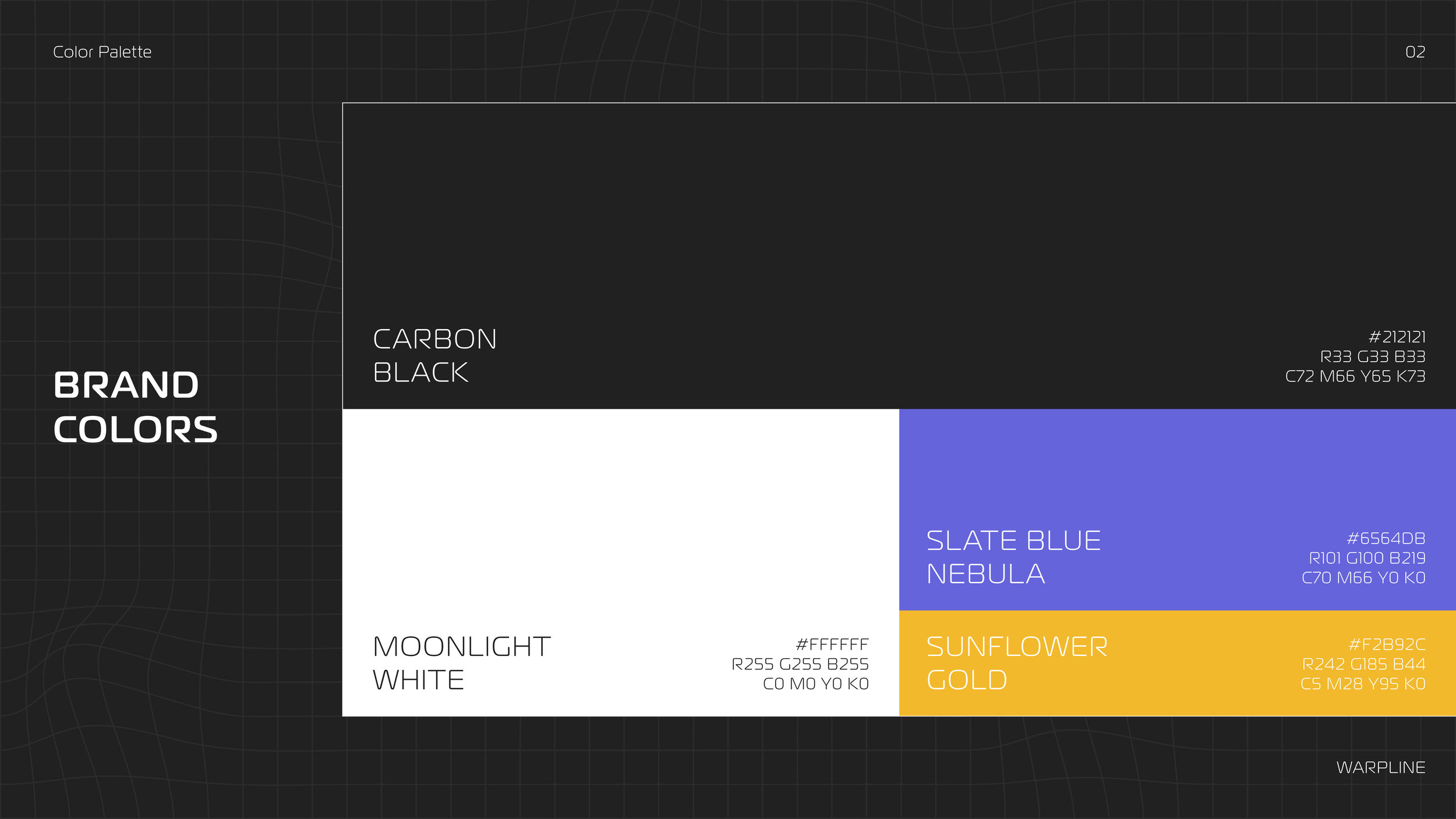
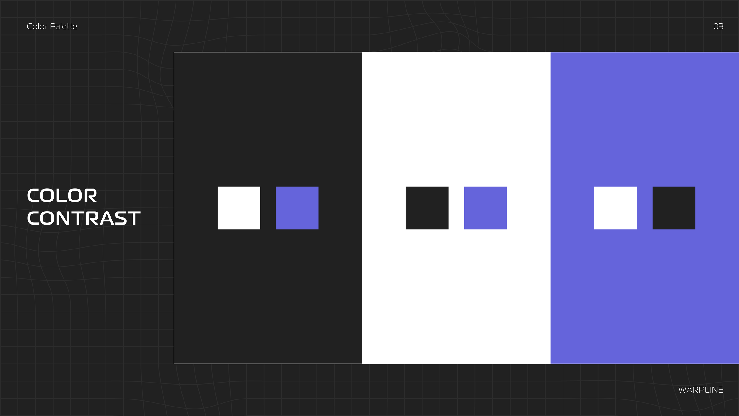
The colors were selected with the idea of combining futuristic and luxury aesthetics. The primary colors are black and white, with slate blue being used as a secondary color and gold used sparingly as an accent.
Wanting to work motion design into this project, I decided to develop a video showing a surface-level concept for Warpline’s website.
My approach combined multiple tools strategically: I designed the layout in Adobe Illustrator, crafted detailed planet textures in Photoshop, and used After Effects to map those textures onto 3D spheres. Then I animated light-speed transitions, adding flowing gas clouds and ethereal music to create an immersive, awe-inspiring experience.